
Branded Flyers for The Pathway School
Brief
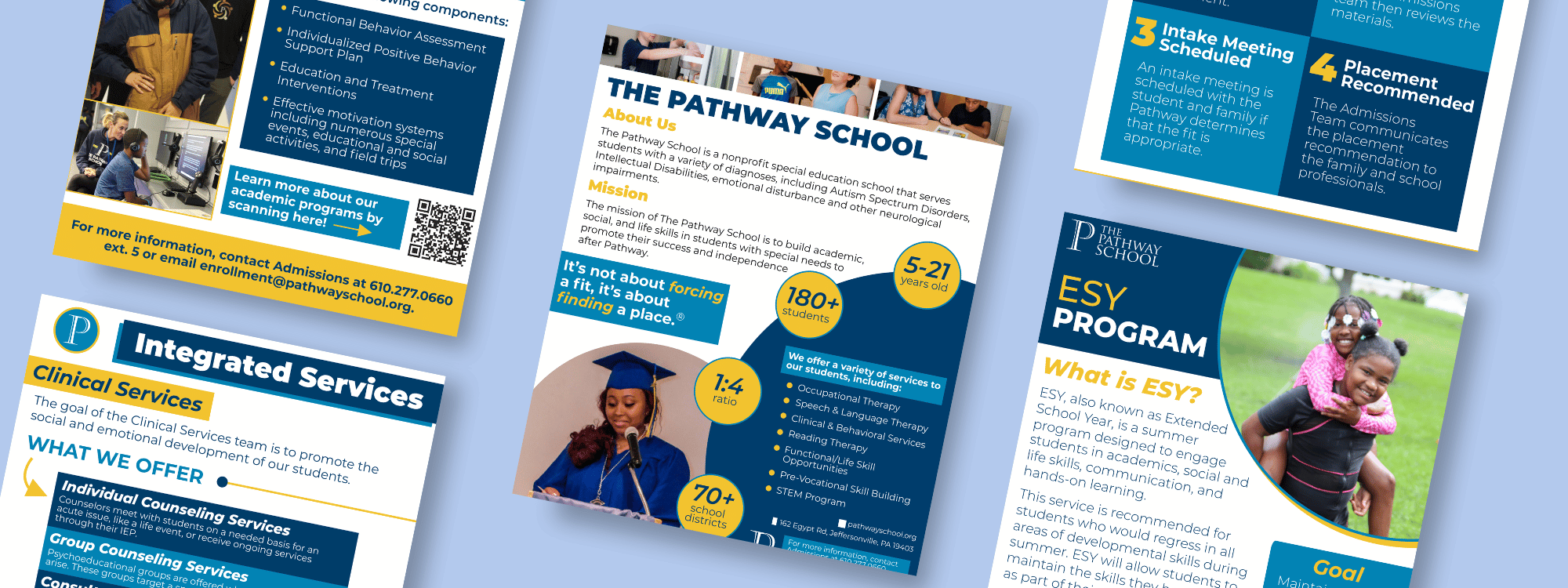
The Pathway School, a K-12+ special education school, needed a suite of resources to support its admissions process. Prospective families had limited materials to turn to when learning about the school and deciding if it was the right fit for their child. I was tasked by the Director of Development and Communications and the Director of Admissions and Marketing to create five distinct flyers covering the school's key programs and services: a general school overview, Extended School Year (ESY), Career Education, Academics, and Integrated Services. The longer-term goal was to make the admissions process more seamless and increase enrollment.
Process
The project began with a clear audience in mind — prospective families exploring their options. Every design decision I made was driven by one goal: make sure families could easily understand and digest the information in front of them. I wrote all copy in a warm, positive tone at an eighth-grade reading level, keeping language simple and accessible, and avoiding jargon that could confuse or overwhelm the reader.
Before designing, I referenced our brand guidelines to ensure the correct fonts and color palette were used across all five flyers, keeping everything consistent with The Pathway School's identity. I then designed each flyer in Adobe InDesign, using a thoughtful balance of photos and text and incorporating bullet points to make key information easy to scan and digest.
One important step was refreshing the photography. The existing photos were outdated, so I coordinated and led all photography efforts on campus, scheduling time with teachers to capture new, authentic images of students. These photos brought the flyers to life and gave prospective families a genuine look at the school community.
After completing an initial draft of all five flyers, I met with both Directors for feedback. Over two rounds of edits and a two-week timeline, we refined the copy and design until everything was ready to share with prospective families.
Outcome and Takeaways
The result was a cohesive suite of five branded flyers that gave prospective families the resources they needed to learn about The Pathway School and take the next step in the admissions process. The flyers are now a key part of the school's admissions and marketing efforts, supporting the longer-term goal of increasing enrollment.
This project reinforced the importance of audience-first design. When you keep the reader at the center of every decision, from the words you choose to the way information is laid out on the page, the work becomes clearer and more impactful. It also deepened my appreciation for brand consistency and the role that collaboration plays in bringing a project to a strong finish.